ART346: Logo Previz
- kiscott8
- Feb 1, 2023
- 2 min read
For the Animated Logo assignment, I'd like to make a logo for "soup." In preparation for this, I looked up different animated graphics of soup. The movements of the letters in the GIF of alphabet soup below were particularly inspiring; I may mimic an "alphabet soup" appearance for some letters in my logo. I could probably do this by toggling the rotation parameters and setting the letters to move along a path. This effect might elicit more soup imagery as opposed to the letters merely sliding into place.

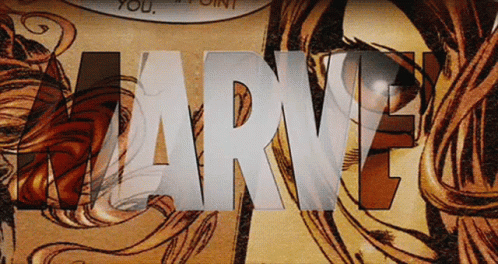
In my logo animation, I want the letter "o" to appear first and be replaced by many flickering pictures of soup, similar (but inversed) to this effect in the Marvel logo, which I really enjoy. This could be done by cropping and offsetting many different pictures of soup in the timeline. I may also potentially add some blurring effects similar to those in the GIF. I think showing the diversity of different kinds of soup would help demonstrate the purpose of my logo: an ode to soup.
I really love the animation of the circles in this GIF; I think the movement is mesmerizing. In my logo, I may want to follow a similar pattern. I particularly like the path the big circle follows: shrinking and then moving to the side. I may do something like this for the movement of the "o." I also enjoy the spinning of the small circles; I may be inspired by these movements for the alphabet letters. I could easily keyframe animations similar to these in After Effects. Overall, I feel like the smooth movements and easing give a clean, professional look that would be helpful in my logo.


Comments